
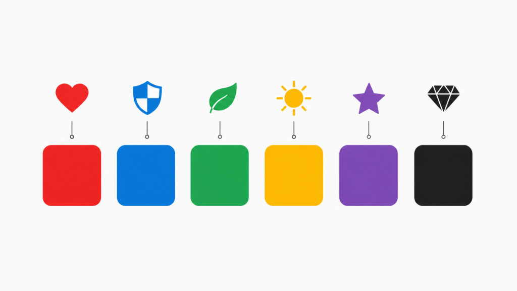
The psychology behind logo colors explains something most of us have felt but never really thought about: why a red logo and a blue one make you feel two completely different things — even if you couldn’t explain why.
That’s not a coincidence. Color is one of the most powerful (and most overlooked) tools in branding. Studies on consumer behavior consistently show that people form judgments about a brand within seconds, and color plays a huge role in that snap decision.
A poorly chosen logo color can make a serious financial company look playful, or turn an exciting startup into something that feels cold and corporate. On the other hand, the right color choice can build instant trust, signal quality, or spark excitement — before a customer reads a single word.
In this guide, we’ll break down the psychology behind the most common logo colors, why big brands choose the colors they do, and how you can apply the same thinking to your own logo or business branding.
Why Color Matters So Much in Branding
Before diving into specific colors, it’s worth understanding why color has such a strong psychological pull in the first place.

The Science Behind Color Perception
- Colors trigger emotional responses almost instantly, often before conscious thought
- Cultural background can shift how a color is perceived (more on that below)
- Consistent color use builds brand recognition over time
- The right color can differentiate a brand within a crowded industry
First Impressions Happen Fast
Research on visual processing suggests that people form an opinion about a brand within a few seconds of seeing its logo. Color is one of the very first things the brain registers — even before shapes or text are fully processed.
This is exactly why so many major companies treat their logo color as a core part of their identity, not just a design choice.
What Each Logo Color Communicates
Let’s go through the major colors used in branding and what psychological associations they typically carry.
Red: Energy, Urgency, and Passion
Red is one of the most attention-grabbing colors, which is why it’s so common in food, retail, and entertainment branding.
- Associated with excitement, energy, and urgency
- Known to stimulate appetite, which is why many food brands use it
- Can also signal boldness or confidence
Common in: fast food, entertainment, retail sales and clearance branding
Blue: Trust, Stability, and Professionalism
Blue is the most widely used logo color among global brands, especially in finance, healthcare, and technology.
- Communicates trust, calmness, and reliability
- Often used by banks and financial institutions to feel secure
- Popular in tech branding to feel dependable and modern
Common in: banking, healthcare, technology, corporate services
Green: Growth, Health, and Nature
Green is closely tied to nature, freshness, and wellness.
- Represents growth, balance, and sustainability
- Frequently used by health, wellness, and eco-friendly brands
- Also associated with financial growth in some contexts
Common in: health and wellness, organic products, sustainability-focused brands
Yellow: Optimism, Warmth, and Attention
Yellow is one of the most cheerful colors on the spectrum, often used to grab attention quickly.
- Associated with happiness, optimism, and friendliness
- Can create a sense of warmth and approachability
- Used carefully, since overuse can feel overwhelming
Common in: family brands, budget-friendly services, food and beverage
Orange: Confidence, Fun, and Affordability
Orange combines the energy of red with the friendliness of yellow.
- Feels playful, energetic, and approachable
- Often associated with affordability and value
- Common in call-to-action buttons because it draws the eye
Common in: e-commerce, entertainment, youth-focused brands
Purple: Luxury, Creativity, and Wisdom
Purple has historically been associated with royalty and luxury.
- Signals sophistication, creativity, and premium quality
- Often used by beauty, wellness, and creative industry brands
- Less common overall, which can help a brand stand out
Common in: beauty, luxury products, creative and artistic brands
Black: Elegance, Authority, and Power
Black is a strong, minimal choice that signals confidence and premium positioning.
- Communicates sophistication, authority, and exclusivity
- Frequently used in luxury fashion and high-end branding
- Pairs well as an accent color with almost any other color
Common in: luxury fashion, premium products, minimalist tech brands
White: Simplicity, Cleanliness, and Minimalism
White is rarely a logo’s only color, but it plays a major supporting role in branding.
- Represents simplicity, cleanliness, and openness
- Common in healthcare, tech, and minimalist branding
- Works well when paired with a bold accent color
Common in: healthcare, minimalist tech, modern lifestyle brands
Common in: healthcare, minimalist tech, modern lifestyle brands
| Color | Core Emotion | Common Industries | Effect on Perception |
| Red | Energy, urgency | Food, retail, entertainment | Grabs attention fast |
| Blue | Trust, stability | Finance, healthcare, tech | Builds confidence |
| Green | Growth, health | Wellness, eco-friendly brands | Feels natural and calm |
| Yellow | Optimism, warmth | Family, food, budget brands | Feels friendly and cheerful |
| Orange | Fun, affordability | E-commerce, entertainment | Encourages action |
| Purple | Luxury, creativity | Beauty, premium brands | Feels sophisticated |
| Black | Authority, elegance | Luxury fashion, premium tech | Feels exclusive |
| White | Simplicity, clarity | Healthcare, minimalist brands | Feels clean and open |
How to Choose the Right Logo Color for Your Brand
Picking a logo color isn’t just about personal preference — it should align with how you want your brand to be perceived.
- Define your brand personality first. Are you playful, serious, luxurious, or approachable?
- Research your industry’s color norms. Standing out is good, but understanding expectations matters too.
- Consider your target audience. Different age groups and cultures can respond differently to certain colors.
- Test your logo in black and white first. A strong logo should work even without color.
- Limit your palette. Most strong logos use one or two primary colors, not five.
A Quick Note on Cultural Differences
Color meaning isn’t universal. For example, white is associated with purity in many Western cultures but can represent mourning in some Eastern cultures. If your brand operates internationally, it’s worth researching how your chosen colors are perceived in your target markets.
Common Mistakes Brands Make With Logo Colors
- Choosing a color purely because it’s a personal favorite, not because it fits the brand
- Using too many colors, which weakens brand recognition
- Ignoring how the logo will look in black-and-white print or single-color applications
- Copying a competitor’s color scheme too closely, which can confuse customers
Avoiding these mistakes helps ensure your logo color works for your brand, not against it.
Where to See Color Psychology in Action
One of the best ways to understand logo color psychology is to study real, well-known brand logos across different industries. You can browse a wide range of brand logos in vector format on SeekVectorLogos.com to compare how different companies use color within their industry — and see which choices hold up even when scaled down or used in black and white.
Frequently Asked Questions (FAQs)
Does logo color really affect sales?
Color alone won’t guarantee sales, but it does influence first impressions and brand perception, which can affect trust and purchasing decisions over time.
What’s the most trustworthy logo color?
Blue is widely considered the most trust-building color, which is why it’s so common in banking, healthcare, and technology branding.
Why do so many food brands use red and yellow?
Red is known to stimulate appetite and grab attention, while yellow feels warm and inviting — together they create a fast, energetic, appetite-triggering combination.
Should I choose one color or multiple colors for my logo?
Most successful logos use one or two primary colors. Too many colors can make a logo harder to recognize and reproduce consistently.
Can the same color mean different things in different industries?
Yes. For example, green can mean “growth” in finance but “freshness” in food branding — context always shapes the meaning.
Is black a safe choice for a logo?
Black works well for brands wanting to convey elegance, authority, or minimalism, but it can feel too serious for playful or family-friendly brands.
How do I know if my logo color fits my brand?
Ask whether the color matches your brand’s personality and how you want customers to feel. If your brand is fun and approachable but your logo feels cold and corporate, it may be worth revisiting.
Do color meanings change across cultures?
Yes, significantly. It’s important to research color perception in your target market, especially if your brand operates internationally.
Should my logo still work in black and white?
Yes. A strong logo should be recognizable by shape and form alone, without depending entirely on color.
Where can I see examples of real brand logos and their color choices?
Vector logo libraries like SeekVectorLogos.com are a great place to browse real brand logos across industries and compare color strategies side by side.
Conclusion
Logo color isn’t just a design detail — it’s a psychological signal that shapes how people feel about your brand before they read a single word. Red sparks urgency, blue builds trust, green feels natural, and black signals authority. None of these associations are accidental; they’re the result of decades of consistent branding across countless industries.
When choosing your own logo color, start with your brand’s personality, research how your industry typically uses color, and make sure your design still holds up in black and white. Get this right, and your logo color will work quietly in the background, shaping perception every single time someone sees your brand.